

Creating a surface design collection
An in-depth look into my pattern making process

Today, I’d like to walk you through my process on how I make a surface design collection. One of my favorite things about art licensing and surface design is that the projects are usually pretty quick! I get to move on from each collection in a short period of time, versus picture books where I’ll be working with the same characters, style and color palette for months. I find both types of work to be rewarding in their own way, but surface design has become an avenue where I feel like there’s room for me to play with different styles and processes, given the short term nature of the work.
What is a surface design collection?
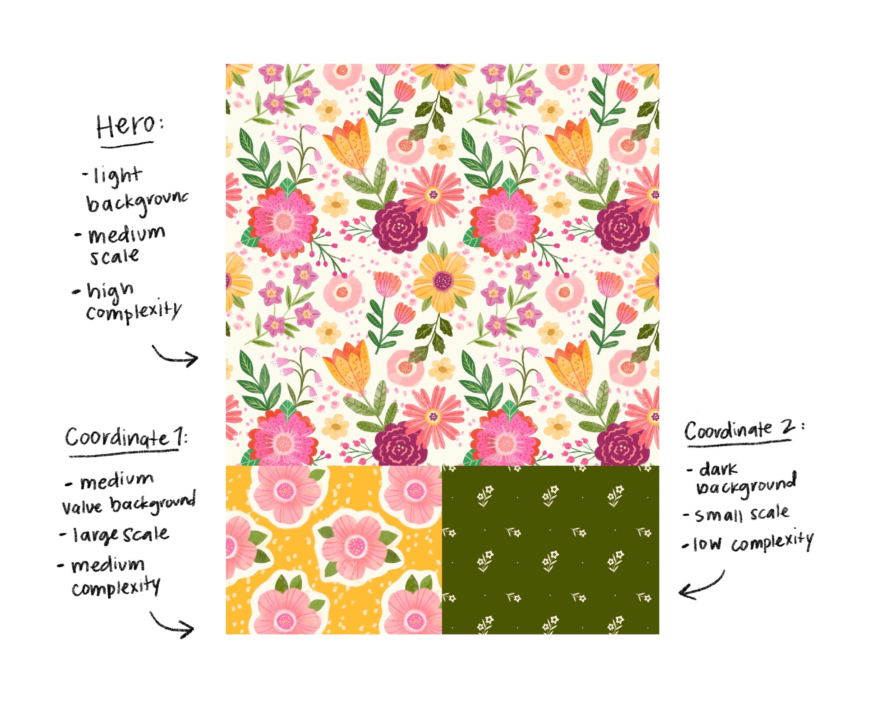
It’s a set of patterns, placement illustrations, or both, created to exist as a unified collection. Collections can vary in the amount of art, (sometimes up to 12 pieces!) but I usually work in a set of three, or a trio. The trio consists of a “hero print,” or the main design and two coordinating patterns.
What is this collection used for? A lot of different products fit under the umbrella of surface design, from greeting cards to bedding to apparel to wallpaper etc. Basically any artwork that can be applied to a surface.
Choosing a theme
The first step is to decide on a theme. Another fun aspect of surface design is that I often choose something I’m already interested or enjoy drawing. Here are a few questions you can consider when choosing a theme:
What special interests are you currently interested in?
Is there a specific product you want to design for (ie what would your own wallpaper look like?)
What are you reading or watching?
What hobbies do you already have?
Is there a specific moment in history or art movement you are interested in?
Where’s the best place you have traveled?
What was the best thing you last ate?
I decided to make a pattern that felt like springtime! I have been loving going on walks in the warmer weather and seeing daffodils everywhere. I also love the cheerful colors associated with the season. I’ve also fantasied about having afternoon tea in a beautiful garden in the Cotswolds. Thus, I landed on an English Garden Tea Party theme.
Research and Moodboard
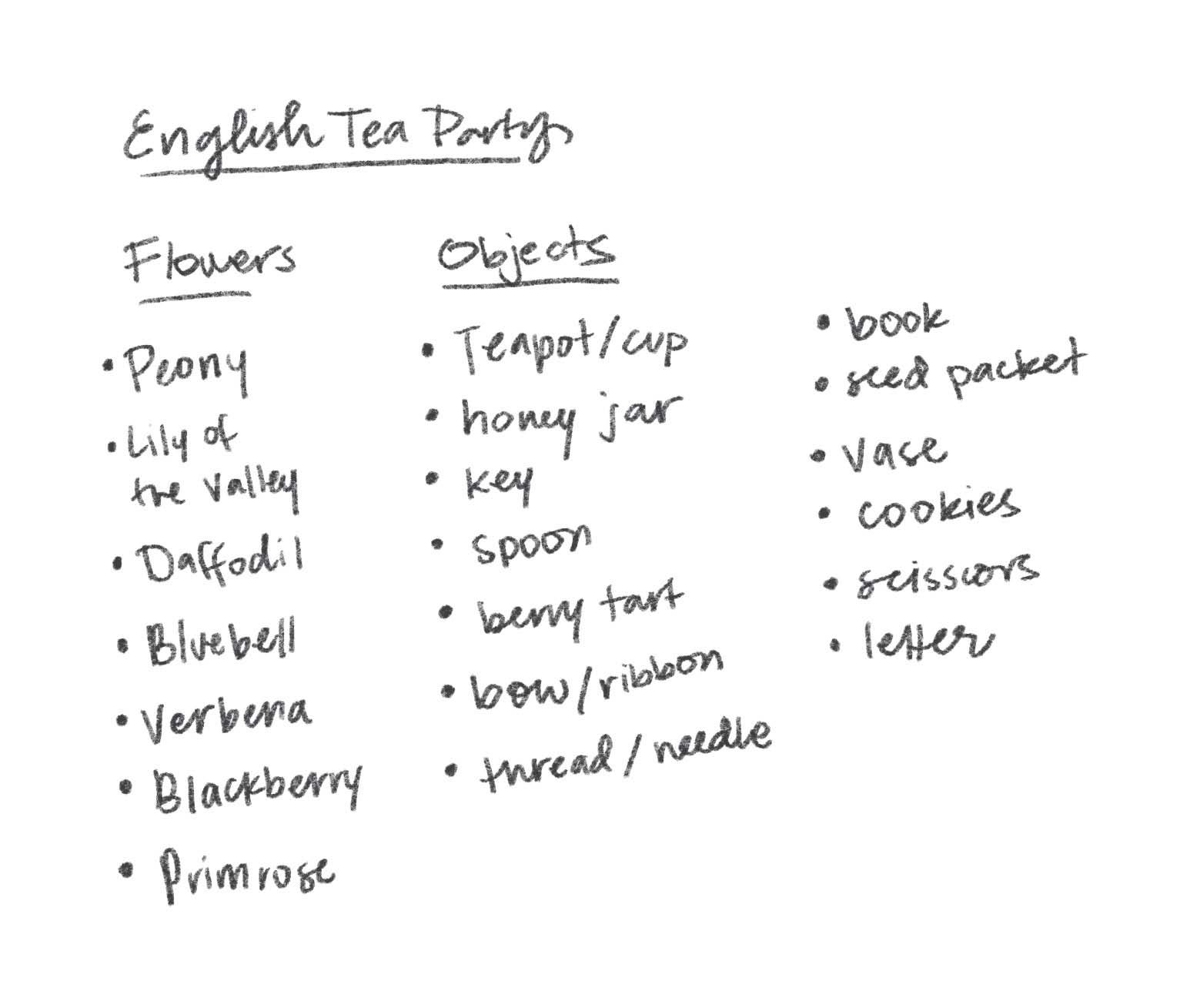
Often times I’ll just start by listing items or subject matter that relates to my theme before even looking at reference or inspiration. This helps get all my jumbled thoughts onto the page. I specifically wanted to include florals into this piece, so I listed spring flowers in England.
Often times my mood boards just exist as a Pinterest board, or I compile the images in Milanote, like I did for this one. I try to make a conscious effort to include inspiration outside of contemporary illustration. In this digital age, It’s super easy to get in the habit of only looking at the art we see from our peers on social media. Eventually, everyone’s art starts to looks the same! I’ve found looking into art history, photography, interior design or objects can help bring a fresh perspective to my work.
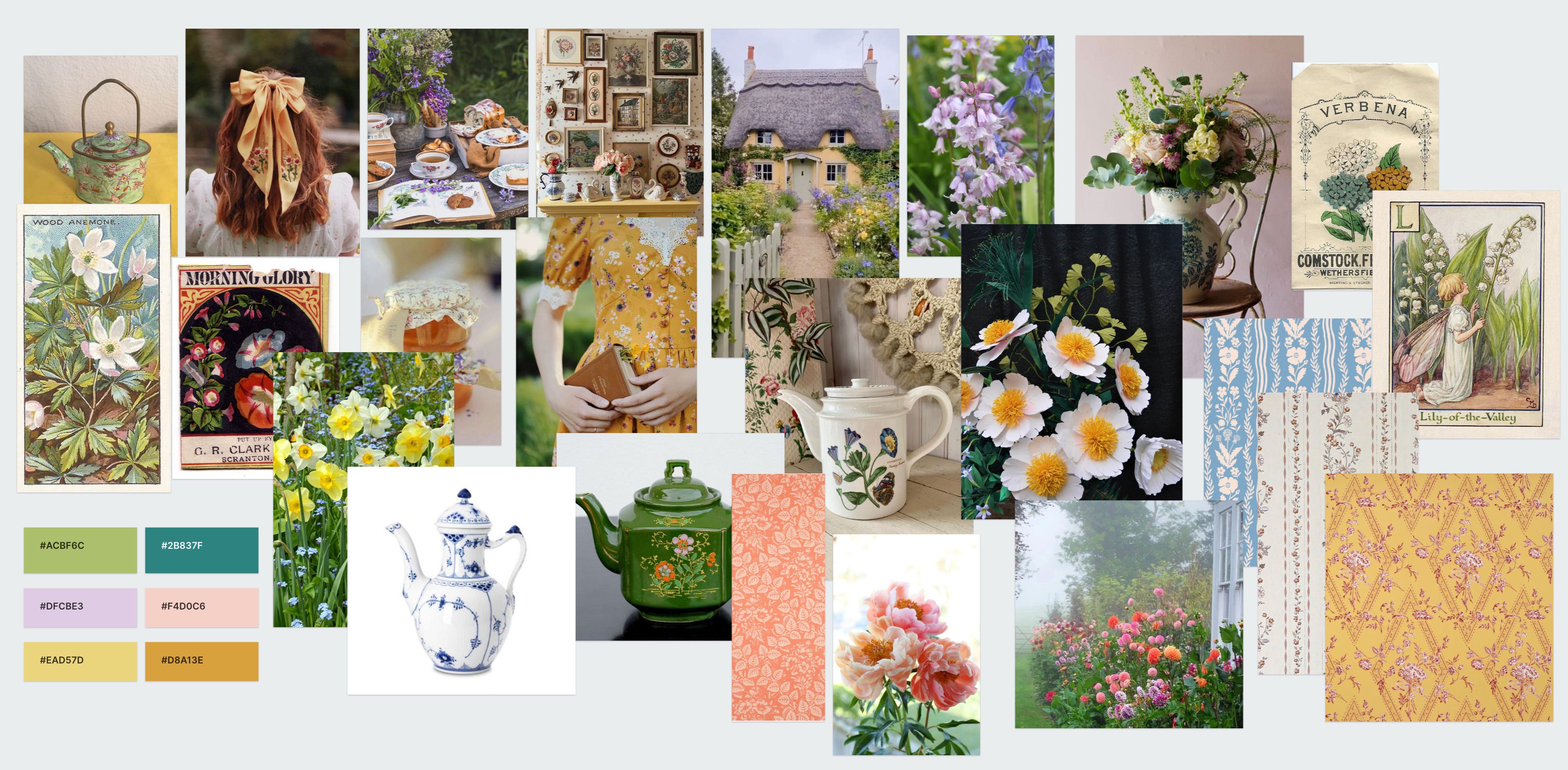
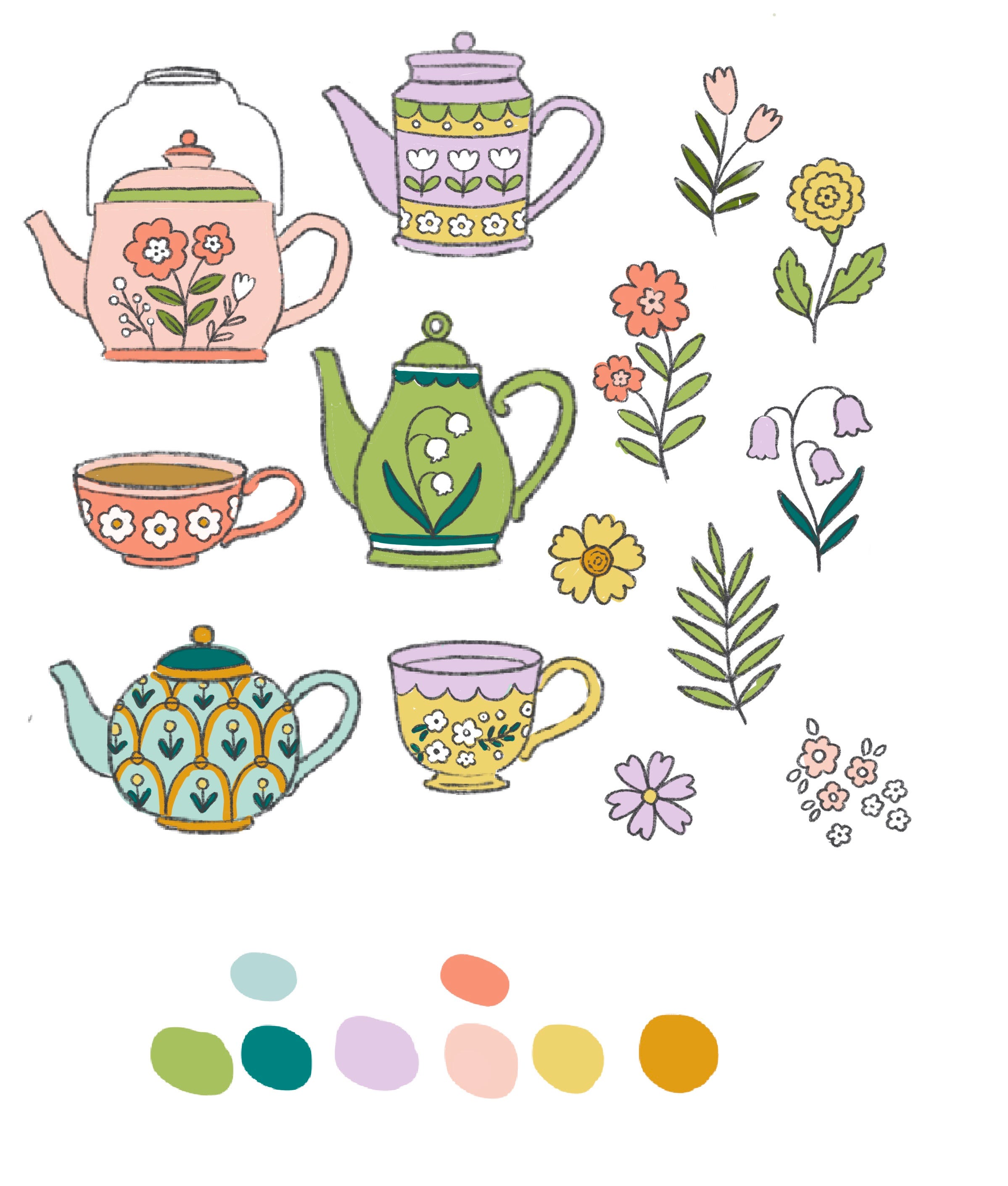
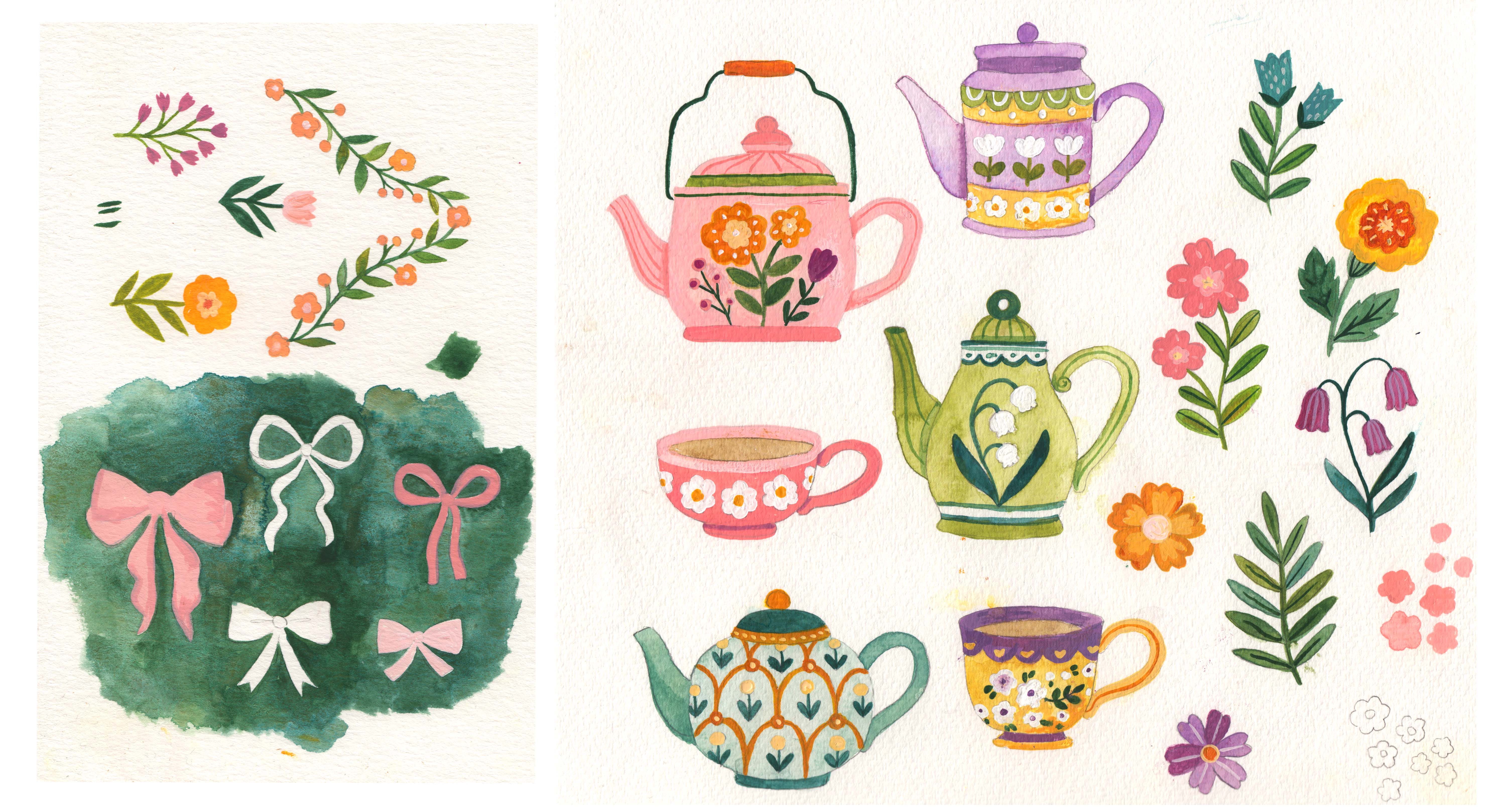
The various shapes of the beautiful teapots caught my attention and I decided I wanted them to be the main focus of my hero pattern. I enjoyed reading a bit about the history of teapots from the V&A’s website.
Sketching
Using the list of elements I generated through brainstorm/research, I begin sketching. I treat this phase just a like a sketchbook page and start drawing everything on one canvas in Procreate.
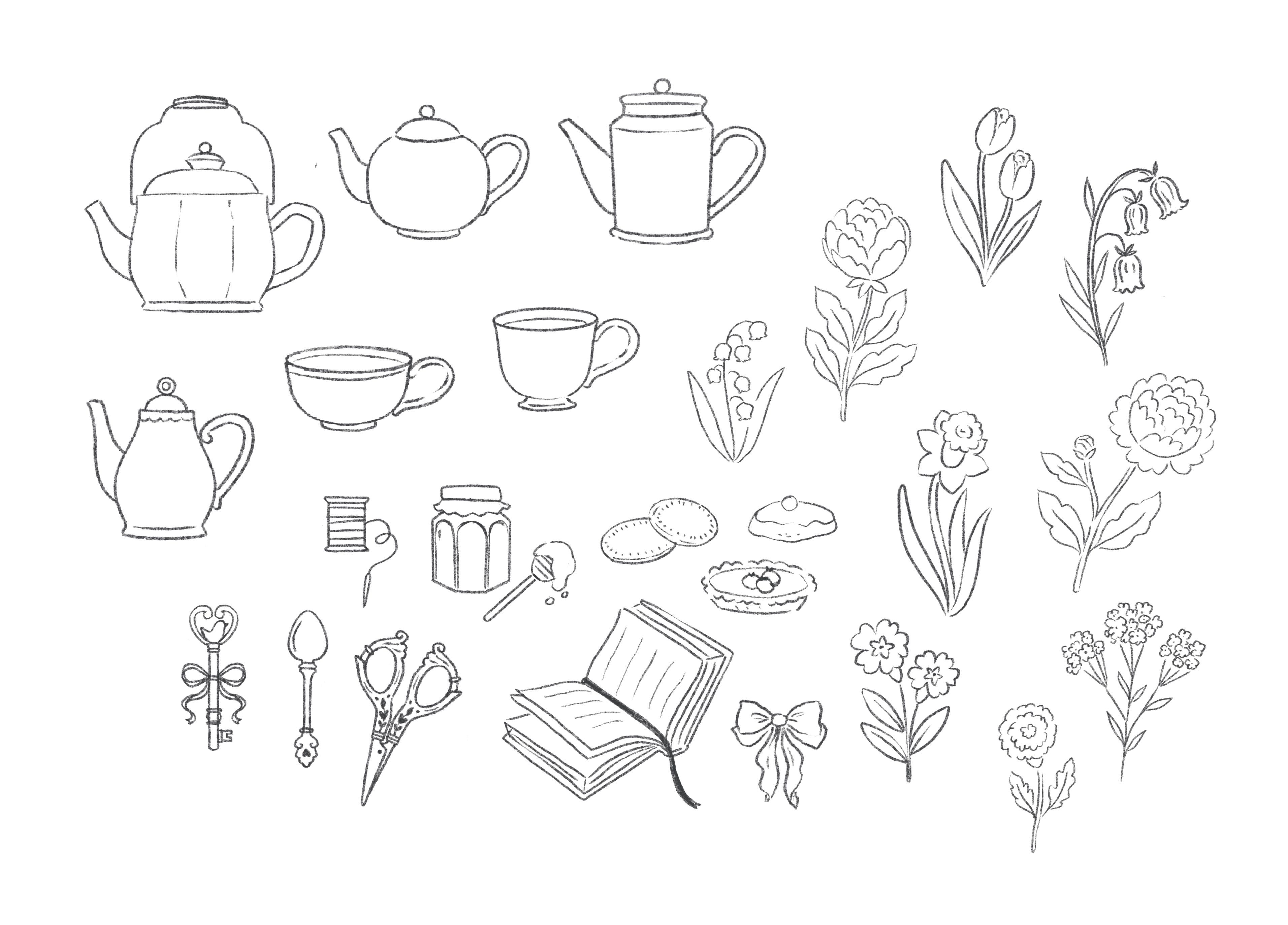
After getting a few motifs down on the page, I decided to simplify my motifs in the second draft so I could focus on the decorations on the teapots themselves.
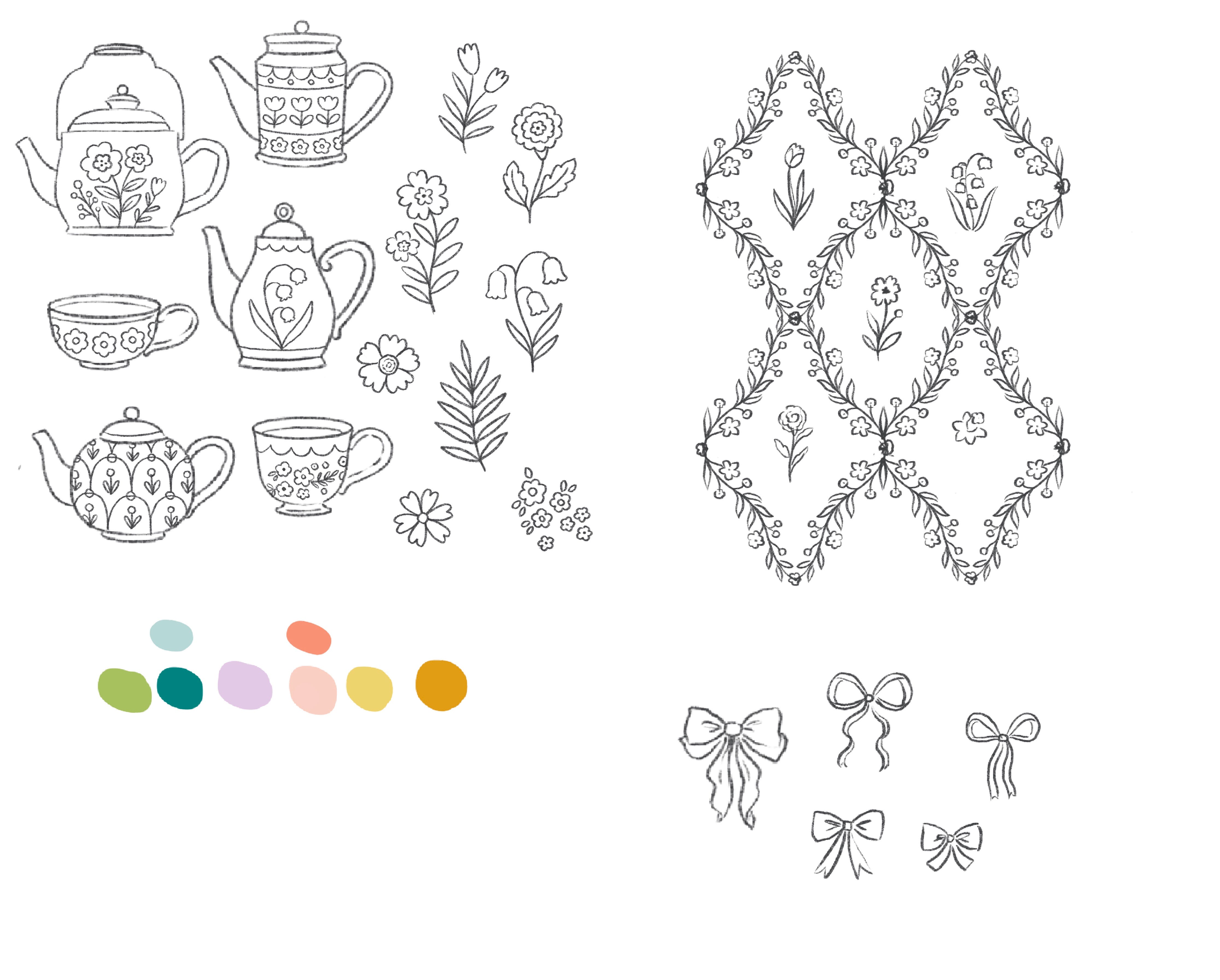
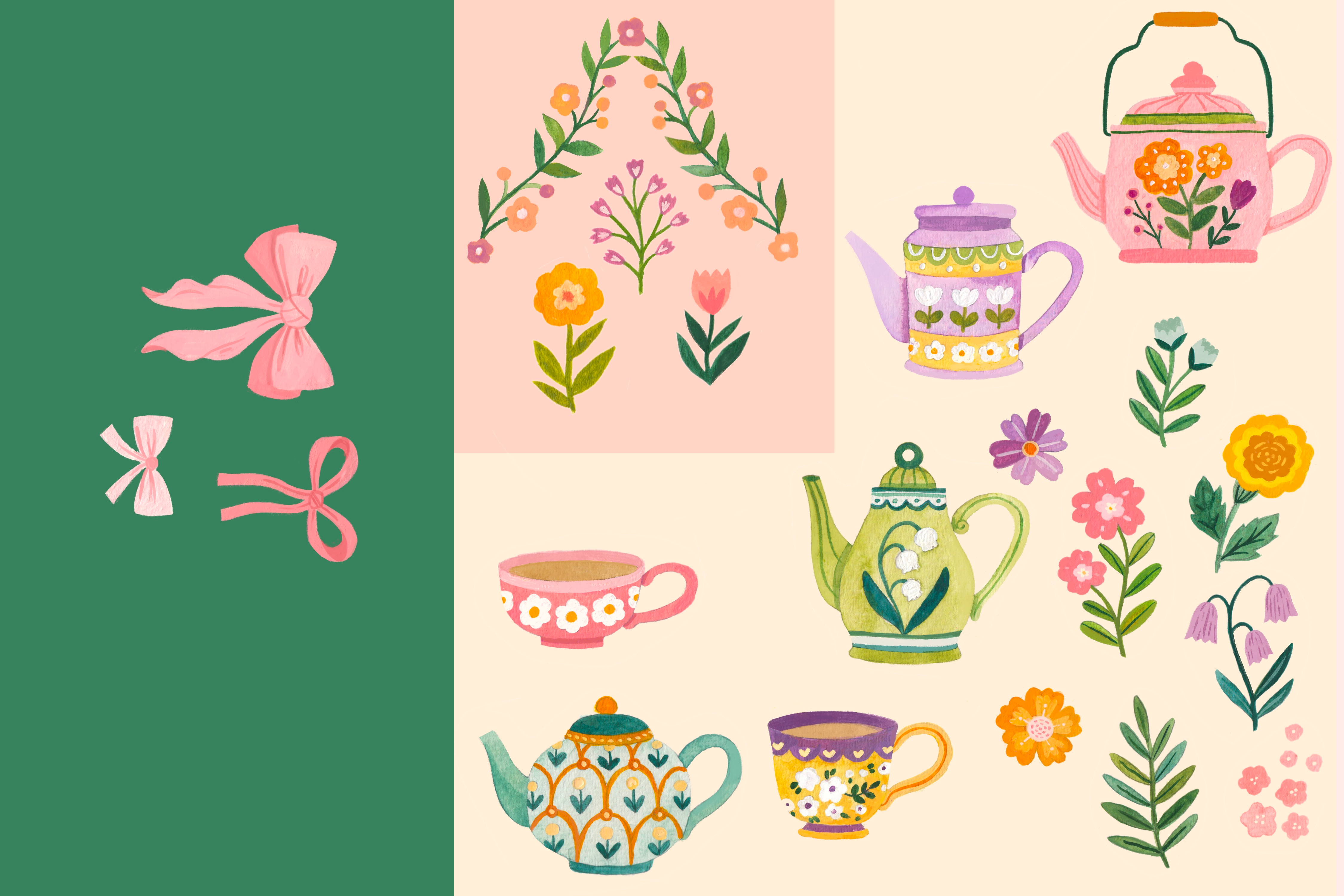
During the sketching phase, I always consider what my coordinating patterns might be like and include those sketches on the same canvas as my hero pattern. Here, the teapot pattern acts as my "hero print” because it sets the theme for the collection and contains the most detail. For my first coordinate, I pulled the bow from my mood board. I was really inspired by these medallion wallpapers I found from Adelphi Paper Hangings and created my own floral medallions.
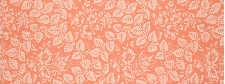
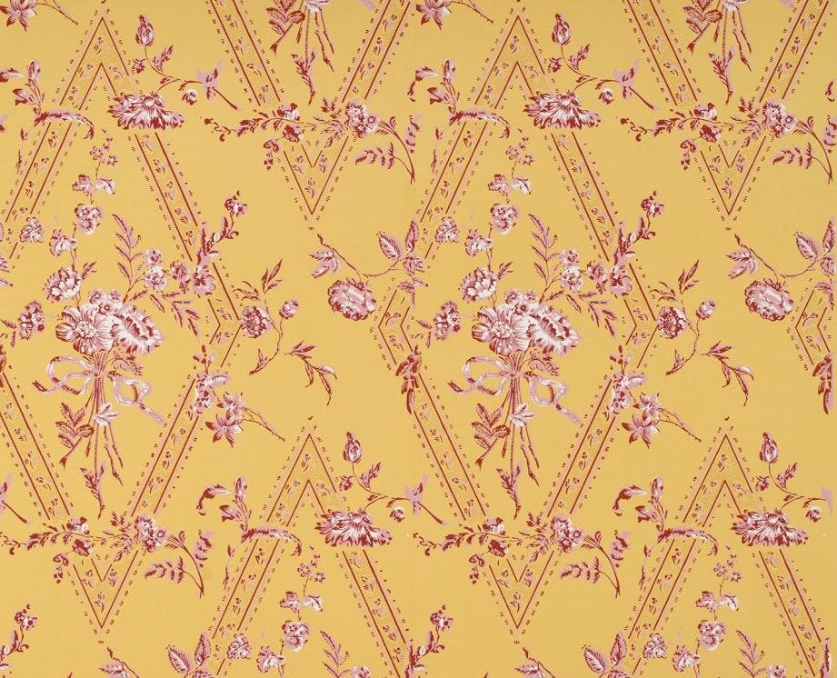
It’s important to consider how your coordinates complement each other through variation. I achieve this through varying three qualities: scale, color values and levels of complexity. Here’s another pattern set example to illustrate this concept:
Why work in collections? When pitching patterns to clients, think of your collection as a “tool box” for an art director to use. You have your hero design and the coordinates support it for various uses. So let’s say your hero design is a greeting card. You can include coordinating patterns that match the style of your card to be used on wrapping paper or gift bags.
Color Rough
One of my goals for 2024 was to regularly work with analog painting, more specifically gouache and watercolor. In order to produce work quickly, the past few years I’ve ended up working digitally almost 100% of the time. I’ve had a growing desire to refresh my process and incorporating traditional materials more often. Painting pattern motifs has been a perfect outlet to practice a new medium, due to the quick pace of each project.
Before going to paint, I made a quick digital color rough. I’ve found doing these color roughs really helps minimize decision fatigue when it comes to the actual painting. Using the color palette I developed in Milanote, I added flat blocks of color to my elements.
Time to Paint!
Here is a time lapse video of the whole painting process:
After painting, I scanned the artwork and brought my designs into photoshop to isolate the elements from the background. This video by The Butterfly & Toadstool was incredibly helpful in learning how to do this. (Especially if your art has textured edges like watercolor). Once I separated my motifs, I made a few tweaks in procreate like adding details, changing up color, and cleaning up edges.
Finally, I made each design into a repeating pattern using Photoshop. (If you’re interested in creating repeat patterns in Photoshop, here’s a great tutorial by Cristina Silva on how to do that). I messed around a bit with the colors in Photoshop, and loved how the floral medallion looked with a higher contrast background.
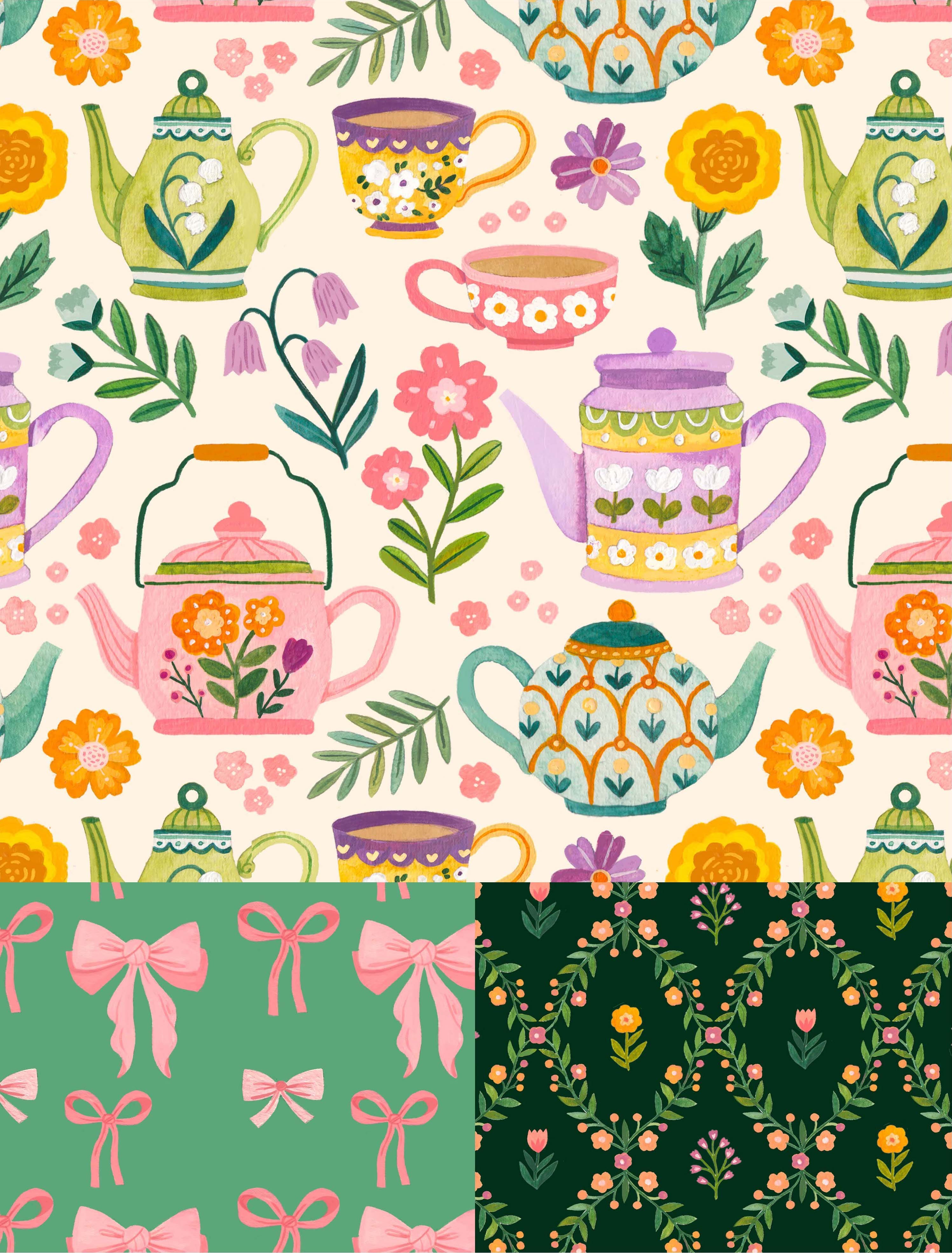
….And here you have it, the finished collection!
If you are currently making your own pattern collection, I would LOVE to see it! And if you have any questions about the surface design world, please leave a comment, email me at nataliebriscoedesign@gmail or send me a note via Instagram @nataliebriscoeillustration :) I would love to nerd out about pattern design with you.
P.S. I made an FAQ page! I met with some Belmont art students earlier this month and I got to talk to them about being an illustrator. They asked me some interview questions and I thought it would be nice to share my answers with you all as well.
I hope you are having a lovely spring and I will see you next month!
Thank you for sharing this. I am fascinated with surface pattern design, and reading your process is helpful.
It was fun to learn about your process. Thanks for sharing that with us!